
My Role
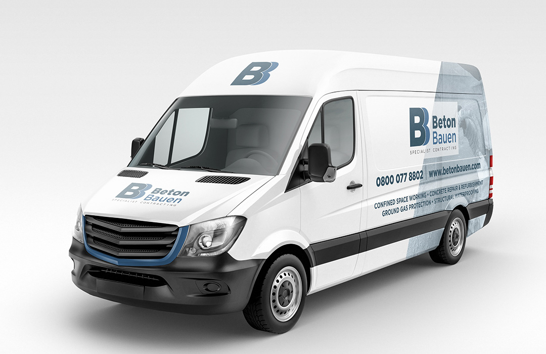
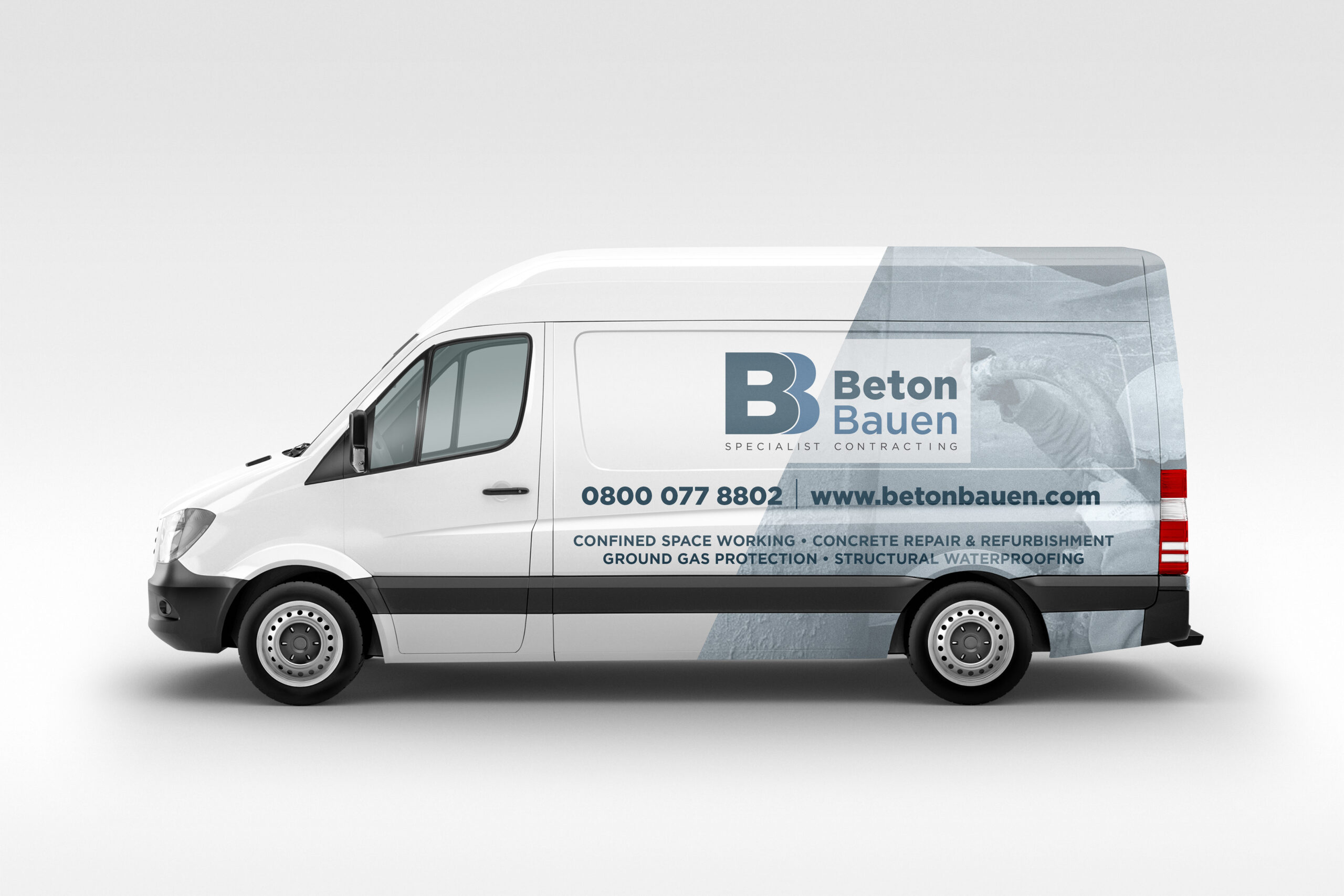
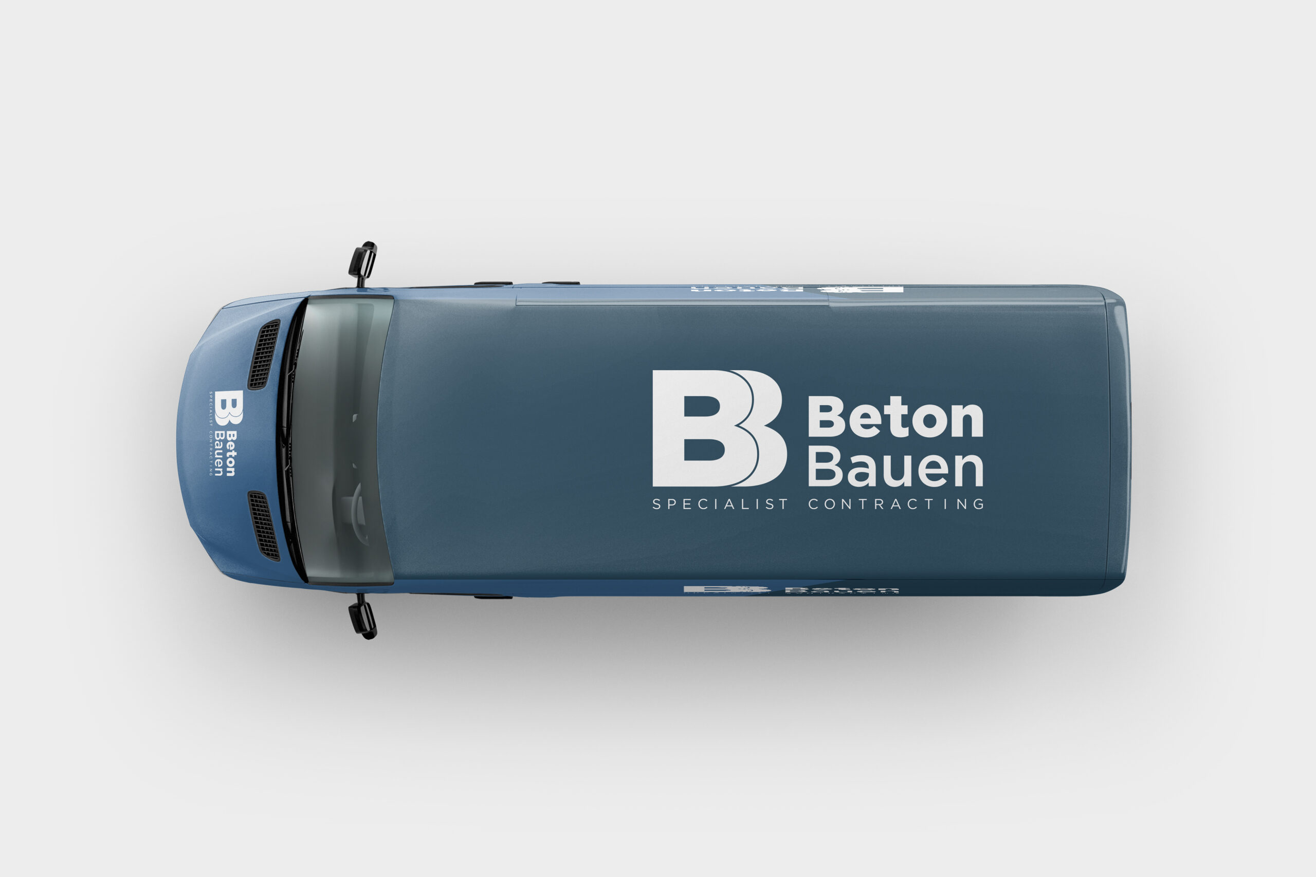
As Creative Director, I was responsible for crafting Beton Bauen’s visual identity—from concept to execution. I designed the brand logo, selected the color and typography systems, and developed the vehicle wrap graphics to ensure consistent branding across all touchpoints. My focus was on translating the company’s core strengths—precision, reliability, and technical expertise—into a cohesive and professional brand presence that stands out both on-site and on the road.
Client: Beton Bauen Ltd
Industry: Specialist Construction & Contracting
Location: United Kingdom
Website: www.betonbauen.com
Overview
Beton Bauen is a specialist contracting firm offering services such as concrete repair and refurbishment, structural waterproofing, confined space working, and ground gas protection. With a growing presence across the UK, the company needed a visual identity and brand application that would reinforce its technical expertise, professionalism, and reliability.
Objective
-
Develop a modern, trustworthy visual identity
-
Ensure consistent branding across print and fleet
-
Communicate the company’s services clearly and professionally
OLD LOGO
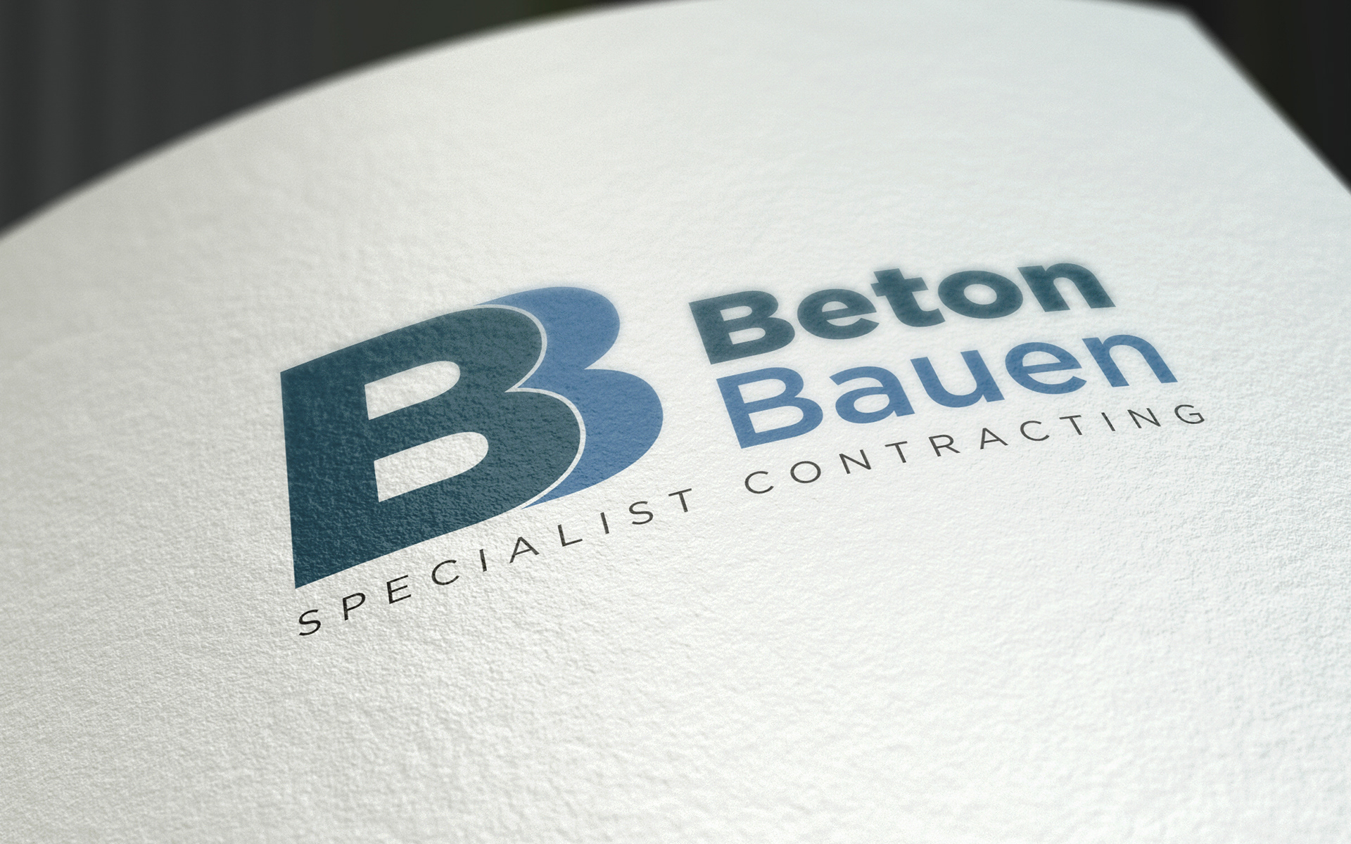
NEW LOGO
Design Solution
-
Logo Design & Identity
-
The new logo features a bold, double-“B” monogram symbolizing strength, structure, and precision—core values of Beton Bauen.
-
A dual-tone blue palette was selected to convey trust, stability, and industrial reliability.
-
The tagline “Specialist Contracting” reinforces the company's niche and expertise.
-
-
Typography & Color System
-
Strong sans-serif typefaces were used for clarity and legibility.
-
A hierarchy of color shades (deep steel blue and sky blue) provides balance and professionalism.
-
VAN DESIGN
Conclusion
The Beton Bauen brand refresh elevated their professional appearance and ensured visual consistency across applications. The identity now confidently reflects their technical focus and commitment to excellence in specialist contracting.